• It
Sign in Get Pulp Pulp 27
Pulp
Sign in Get Pulp Pulp 27
Pulp
  • Inspiration83
  • Stories81
  • News166
  • Pulp Archive
  • Materials Index
  • About Pulp
  • Tell Us
  • Sign in
  • Get Pulp
  • Pulp 27
  • It
Browse Themes
Corporate communicationDigital printingGraphic designIllustrationInterviewsLabelLarge formatPackagingPeople & PaperPhotographyPrintingPublishingSustainabilityInspirationStoriesNews
Pulp

Log-In

Please enter your credentials to access all Pulp contents.

Forgot your password?

New to Pulp? Register for free

New to Pulp?

Register for free to have full access to our content.

Register

3 min minutes
News

Renewal and joy

The Fondation d’entreprise Hermès’ latest greeting card continues a tradition of clever, thoughtful design
Graphic designPeople & PaperPrinting
The Fondation d’entreprise Hermès’ card for 2023.

Atelier Tout va bien, the Dijon-based studio of Anna Chevance and Mathias Reynoird (see Pulp 8), has produced some impressive – and inventive – greetings card designs for the Fondation d’entreprise Hermès in recent years.

The Fondation d’entreprise Hermès promotes learning activities through a range of programmes and initiatives with the aim of supporting craft and nurturing future creative practitioners. Launched by the fashion brand in 2008, the foundation focuses on the transmission of creative skills across the arts.

The Fondation d’entreprise Hermès’ card for 2023 highlights the work of the organisation’s Manuterra programme, the environmental education scheme launched by the company in 2021. The scheme aims to introduce young people to gardening and offers sessions whereby students can learn about and cultivate the natural world.

With this in mind, ATVB interpreted the idea of plants coming into bloom for the latest greetings card, explains Chevance. ‘Blossoming is a symbol [for] the energy of renewal and the joy that comes with it.’

The studio used Arena White Rough 300g because of its ‘special touch and great adaptability to different printing techniques,’ says Chevance. The Fondation d’entreprise Hermès’ graphic guidelines also encourages the use of the particular paper range, according to the studio. The card was printed by Imprimerie du Marais.

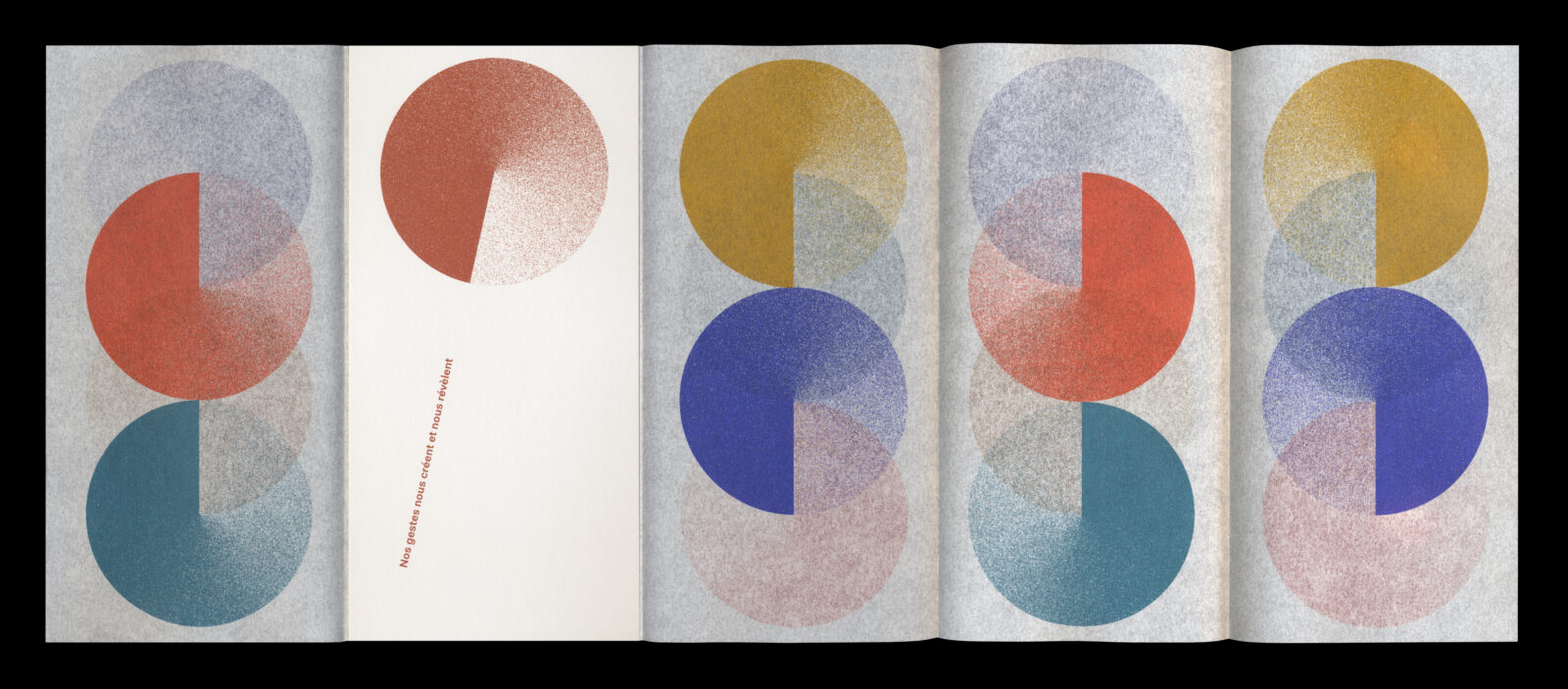
Last year, ATVB also designed the card for the foundation’s annual evening event, a special dinner at the Atelier Des Lumières in Paris, an exhibition space that showcases immersive video shows.

The resulting ten-page, roll-fold leaflet was made up of two thick cards and used five spot colours, printed again by Imprimerie du Marais on the translucent paper Pergamenata Bianca 90g and Arena White Rough.

Card for the foundation’s annual evening event, a special dinner at the Atelier Des Lumières in Paris.

Papers: Arena White Rough, Pergamenata Bianca.

See article in Pulp 08.

ateliertoutvabien.com

Atelier Tout va bien Instagram

fondationdentreprisehermes.org

imprimeriedumarais.com

Featured Materials

Arena

The Arena range is available in four shades: a bright Ivory, on OBA-free Natural, a warm White and a cool Extra White in a wide choice of sheet sizes, grain directions and grammages. Arena is available in three finishes: Smooth, Rough and Bulk. Also available in self-adhesive sheet version.

Related articles

Stories 06/06/2022

People and paper: Matt Appleton

Designer Matt Appleton’s sensitive and experimental books for the art world make imaginative use of Fedrigoni stock. By Vici MacDonald
Graphic designInterviews
News 29/12/2022

Two years of silence

Sara Magni’s photobook documents the pandemic’s devastating impact on the live music industry
PhotographyPrintingPublishing
Inspiration 27/07/2023

Italian type and cinema

Design-Associati’s wall calendars celebrate Italian culture
Graphic designPrinting
News 14/09/2023

String theory

Tradition and craftsmanship shine through in Meteorito Estudio’s handmade approach to Calcetas wine packaging
Graphic designLabelPrinting
Pulp © 2025
Fedrigoni
Fedrigoni
COOKIE POLICY PRIVACY POLICY ACCESSIBILITY STATEMENT
Pulp © 2025