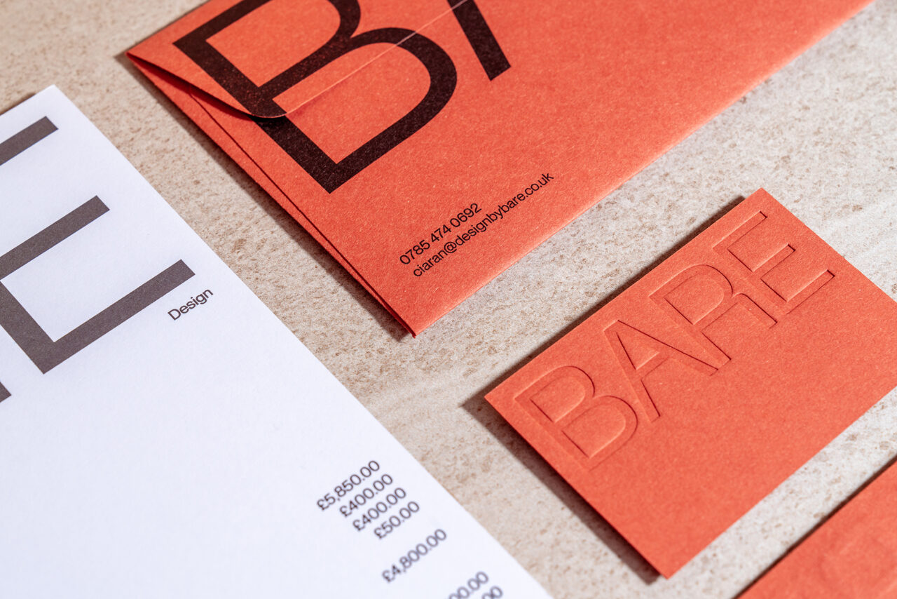
British design practice Temple has created the brand identity for Bare, a new architectural and interior design firm that specialises in applications of ‘micro cement’.
‘Bare provides its expertise to high-end commercial and residential properties in and around London,’ explains Colin Berwick, Temple’s creative director. ‘Given the company’s name, we employed a minimalist brand identity that presents a tactile feel and quality finish to match their distinguished showcase of work.’
The studio, based in the seaside town of Newquay, Cornwall, chose typefaces Neue Machina and Neue Montreal (Pangram Pangram) as the main element of Bare’s branding. Berwick praises the type’s ‘architectural qualities’, which, he says, ‘gives all communications a striking and iconic aesthetic.’
Temple has designed business cards, colour sample packs and stationery as part of the branding system, including headed paper, envelopes and tape. ‘Material selection and finishing techniques were key to the end result,’ says Berwick. ‘We wanted every communication to demonstrate quality craftsmanship and a palpable sense of micro cement’s nature and character.’


